


Guidelines for Writing an Academic Poster
What is an Academic Poster?
An academic poster is a visual medium designed to summarize information or research in a concise and visually appealing way. Academic posters are primarily used at conferences, where attendees can view the presentation and engage in dialogue with the author.
An academic poster typically combines short text with tables, graphs, images, and other visual elements. Unlike regular posters, which tend to be more abstract and colorful, academic posters include a clear structure and well-defined sections to provide effective display of knowledge.
Principles of a Successful Academic Poster
• Key information is seen from afar (approximately 3 meters)
• A short, compelling, and engaging title that generates interest
• Word count: between 300 and 800 words of clear, engaging text
• Use of bullet points, numbering, and headings for better readability
• Effective use of graphics, color, and fonts
• Consistent and clean visual design
• Includes acknowledgements, researcher name, and institutional affiliation
Core Components of an Academic Poster
Title & Author Information
• Clear and engaging title
• Author name(s) and institutional affiliation
• Contact details (email, phone)
Key Sections (adapted to field and topic)
• Abstract
• Introduction / Background
• Research Objectives / Research Questions
• Methods / Methodology
• Results
• Discussion & Conclusions
• References
• Acknowledgements
Planning Your Poster: Key Questions
Before you begin, answer the following three questions:
1. What is the most important, interesting, or unique finding from my research?
2. How can I share my research visually with conference attendees? Should I use diagrams, graphs, or images?
3. What additional information (not shown on the poster) would be valuable to share in a conversation?
Design Principles
Layout & Structure
• Follow a logical and clear reading format (left to right for English posters, or top to bottom in columns)
• Use columns or clearly defined panels/frames
Color Usage
• Simple and consistent color palette (2–3 primary colors)
• Good contrast between text and background
• Preferably a light background with dark text (easier to read)
• Avoid dark or overly colorful backgrounds, keep backgrounds light and clean
• Use color strategically to highlight key points
Typography (Fonts)
• Use a clear, readable font: sans-serif fonts are recommended for posters
• Recommended font sizes:
+ Title: 72 – 120 pt
+ Subheadings: 36 – 48 pt
+ Body text: 24 – 36 pt
+ References & notes: 18 – 24 pt
• Maintain consistency in font sizes throughout the poster
• Avoid excessive use of different font types (2–3 maximum)
Visual Elements
• Use high-quality images, graphs, and tables
• Ensure all images and graphs are clearly labelled
• Credit the sources of all images
• Make effective use of white space
• Avoid thick borders around text boxes
Text
• Use bullet points and lists instead of long paragraphs
• Keep text concise and focused
• Avoid overly technical language (unless your audience consists solely of specialists)
• Proofread carefully and ensure linguistic accuracy
Tips for Turning Your Research into a Poster
Make sure to save the visual elements throughout your research process:
• Screenshots of data searches
• Images of equipment used
• Photos of yourself collecting data or working in the lab
• Workflow diagrams of your research process
Recommended Software for Poster Design
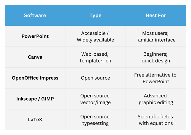
Poster Size & Orientation
• Common size: 90 × 120 cm (36 × 48 inches)
• Always confirm the specific requirements of the conference in advance
• Orientation: usually portrait; sometimes landscape
• Set the template in your software to the final print size
Adapting to Your Target Audience
Consider the following when designing your poster:
• Know your audience: are they specialists in the field or a general audience?
• Adapt the language level and technical explanations accordingly
• Consider what the audience needs to understand from your research
• Ask yourself: what is the single key message you want the audience to take away?
Accessibility
• Ensure sufficient contrast for people with visual impairments
• Do not rely on colour alone to convey information
• Ensure all text is readable both up close and from a distance
• Consider adding a QR code linking to a digital version or additional information
Preparing for the Presentation
• Prepare a short verbal presentation (2–3 minutes) to accompany the poster
• Be ready to answer questions from the audience
• Bring business cards or printed information sheets
• Consider preparing a digital version of the poster for easy sharing
Pre-Print Checklist
• All required information is on the poster (title, authors, affiliation, references)
• Text is legible from 3 metres
• No spelling or grammar errors
• All images and graphs are labelled
• Colours and fonts are consistent
• Layout is logical and clear
• Sufficient white space is present
• Poster is designed at the correct size for printing
• A digital backup version exists
Printing
• Print with a high-quality printer or professional print service
• Check file size and resolution (minimum 300 DPI)
• Print a small test version to check colors and layout
• Allow sufficient time for printing — do not leave this to the last minute
• Consider print materials: thick paper, canvas, or plastic/foam board
Good luck!
This document was prepared based on guidelines from:
Thompson Rivers University (TRU)